Conversion copywriters: The people who write landing page content that drives reader revenue and sales. They are great people! Their writing draws in readers, generates conversions, and ultimately produces money for your business.
Wouldn’t you like to have that skill?
There’s good news: it’s only partial craftsmanship. The rest is technology. The technique you can learn and master.
You – yes, you!
You can too, as long as you understand the techniques involved so you can create awesome landing pages for your niche site affiliate marketing to sell your own digital products of really focus in on selling an affiliate offer.
A landing page should be easy to scan
A good first impression is of course essential and a good landing page does just that, giving a first impression.
It should therefore be easy to scan, people read the headline, maybe the subheading and then quickly scroll through to see what the page is about.
You can take a look at how people navigate through a landing page with a visitor’s video made with Hotjar.
It is estimated that you have about 8 seconds to convince users to stay on your page, so the value proposition should be fast and convincing.
Conversion is very much a science of the mind. How your prospect’s mind processes information, makes decisions, and decides to convert.
In this post, I will describe 9 writing techniques that have been proven to work.
First briefly about using landing pages in your marketing efforts.
After you’ve put in the time to generate traffic, here’s how to convert traffic into leads and sales using these techniques.
1) Use customer testimonials
One of the most powerful conversion techniques isn’t about writing at all. It’s about getting happy customers to write your texts for you.
Testimonials produce conversions like nothing else can. It is impossible to write texts as well as your client.
Why?
Because good content depends on the source, not just the style and content. Testimonials are compelling because they show the customer what they will experience when they use your product or service.
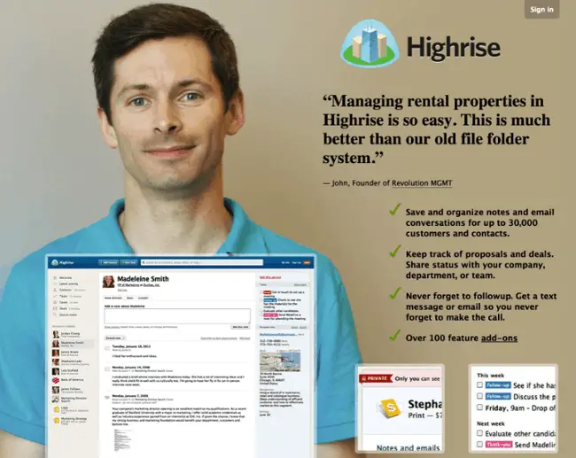
A key to successful, high-converting landing pages is that they put testimonials front and center, preferably with a photo of the customer next to a quote.
Most landing pages that do well have testimonials somewhere on the page, but you can also use it as your headline.
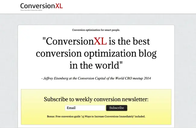
Remember, your best conversion writers are your customers. Let them speak for themselves, social proof is a powerful addition to your copywriting and marketing strategy.
Even more trust factors
Also add other trust factors to your page.
Confidence signals, such as logos of well-known companies you’ve done business with, awards you’ve won, and associations you’re a member of, build trust with the visitor.
A great landing page puts its best foot forward to reassure visitors so they can engage with your offering with confidence.
2) Emphasize the benefits, not the product or service
One of the most important lessons I’ve learned in online marketing is that customers don’t really care about your products or services.
In other words, they don’t care about the “solution” you’re trying to sell.
Traditionally, sales were based on the “solution-selling method”.
“Sellers are trained to tailor a solution to a recognized customer need and demonstrate why it outperforms the competition.”
This approach no longer works for one very simple reason: customers already know which solution they are looking for. They are able to learn just about anything thanks to the internet and search engines.
Customers not only know the solution, they also know:
the features they are looking for
the requirements that the product must meet
a benchmark price
If you only provide your solution, you are not giving your customers what they need and want.
You have to pitch benefits.
It’s fine to mention your solution, because that is a sign to the customer that he or she is in the right place, but don’t put that solution first.
Instead, emphasize the benefits.
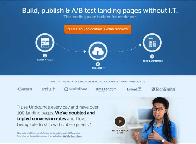
Let’s take a look at an example from Unbounce, who successfully highlight the benefits of their product on this landing page: “Without IT”; “build a high converting landing page now”
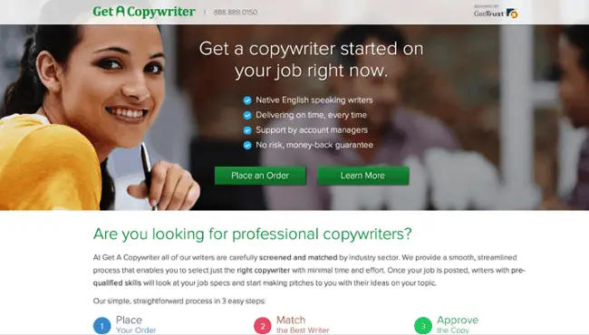
GetACopywriter.com leads with benefits on their landing page, shown below. Their ideal clients are looking for copywriters, so they just pitch the benefits of getting a copywriter through their service.
Jaybird, a company that sells high-end Bluetooth headsets, uses a landing page that talks solely about benefits.
There is little about solutions here. What sets the Bluebuds apart from everyone else is the benefits.

Benefits beat solutions every time.
If you want to take your copywriting to the next level and increase conversion rates, you need to put customer benefits at the forefront of your marketing efforts.
3) Spend time writing a super headline
This isn’t the best news you’ll read all day, but someone has to say it. People don’t read your landing page texts carefully.
They scan, they slide, and they run their eyes across the page, but they don’t (usually) read every word.
What should a copywriter do? Are you looking for a job where someone appreciates our hard work?
No. We adapt to the customer and produce a page that forces them to convert despite their scanning habits. Here’s what customers pay attention to:
The head
The subtitle (usually)
The pictures
CTA Buttons
After that, customers may or may not read the following:
Main section
bullet points
Short paragraphs
Image captions
That should give you an idea of what to focus on as you write your conversion copy.
The most important piece of content is the ten or fifteen words in the headline. Focus on that and perfect that, and you’ve come a long way.
To help the “non-readers” convert, you need to do the following:
Make your head big, strong and clear.
Use an attractive subheadline that explains the benefits of your product.
Show large images demonstrating the benefits of your products and explain your message.
Use strong texts in your CTA.
Break your web copy into main sections, led by a large-font heading.
Use bullet points to discuss the benefits of your product. Short bullets. Not long.
Use short paragraphs instead of long blocks of text. Any paragraph of more than five lines can be difficult to digest.
Use captions for your images.
So when you create a landing page, you should pay attention to “scannability”. Is it easy to scan by putting your main point in the headline while using subheadings and bullet points for more information.
But it doesn’t stop there. Also use the right fonts and colors to indicate the information hierarchy and direct the visitor’s attention to the most important elements.
Size, color and contrast are your weapons.
4) Keep the words simple
The best conversion copy you’re going to read comes in these two words: keep it simple.
You might be as much of a writer as Stephen King or J.K. Rowling, but it doesn’t really matter because literary prowess is useless in the conversion copy.
Your most powerful writing skill is simplicity. Simplicity sells.
Take Optimizely for example. They produce some of the most brilliant landing pages ever created for their clients, but take a look at their own landing page:
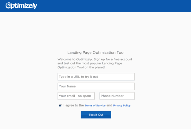
Is that it? Yes yes it is. And it is very effective.
Why?
Because it is so incredibly simple.
Let’s go to another landing page service. This is their landing page:
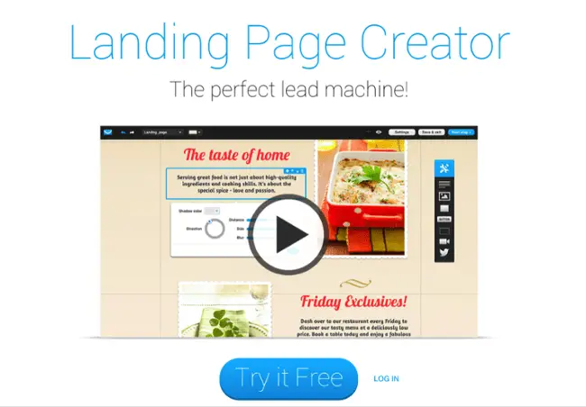
Simplicity again.
Did whoever wrote those landing pages sit for hours on end brainstorming, testing, tweaking, standing in front of a white board with a handful of colored markers, flipping through a thesaurus, taking long walks in nature, and meditating on the meaning of life? in order to produce such brilliant simplicity?
No. They just wrote the simplest, clearest statements they could.
But simplicity doesn’t mean replacing creativity with meaningless buzzwords.
ConversionXL created a list of words that marketers should avoid.
Here are phrases you don’t want to use in your marketing:
“On Demand Marketing Software”
“Integrated Solutions”
“Flexible platform”
“World Leader”
“A once-in-a-lifetime opportunity”
“Changing the way X is done”
“Exceeding customer expectations”
Those cliches don’t work anymore. You have to keep it simple. Here are some tips for keeping your landing page simple:
Use a simple sentence structure
Keep the sentences short
Use short words. Short words are easy to understand and scan
Don’t choose too difficult words
Be clear and concise. Use the most basic words to describe what you are trying to say
If you can be simple, you can write great conversion texts.
5) Write like a human
There’s another technique that will help you crush your competition: sound like a human being.
At some point, some copywriters decided it would be great to produce web copy that sounded tense and robotic.
Who writes this stuff?
And who reads this stuff?
I don’t know, but I do know that no one wants it.
Humans prefer to interact with other humans, not robots. That’s why your copy should sound like a human wrote it.
Here are some specific things you can do to personalize your writing:
Write as you speak
Use normal words, like the ones you would use if you were talking to a ten-year-old. For example, why use ‘pleasant’ when you can use ‘friendly’?
Use short sentences
Break grammar rules if the writing still sounds good and natural
be funny
Use the first person
Use expressions that you would use in a normal conversation. “Serious.” “I think…” “Wait a minute.” “It was crazy.” “Wow.” “It was pretty cool.” “It’s like …”
Ramit Sethi, a personal financial advisor, entrepreneur and author of the famous blog “I teach you to be rich”, has a sky-high conversion rate and a powerful personal style.
His blogs read like a personal email to a best friend. He doesn’t even mind throwing in a few words that he would use if he was at the pub with his friends.
Check out this excerpt from one of his blog posts:
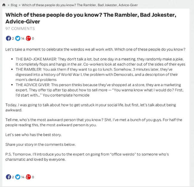
Try to distract yourself from the idea that you are writing ‘copy’ and think of it more as a conversation. If you do, you write better.
You sound like a human. Your conversion rates will go up.
6) Use numbers and get specific
The more specific you are, the more believable and persuasive you will be. Which of these claims is more convincing to you?
“Your conversion rates will explode!”
“Over the past 90 days, customer conversions have increased by an average of 78.2%.”
The second is much more specific and therefore more credible.
Everyone can make general statements about great results, but not everyone can provide detailed statistics.
Let’s look at an example of a TeamGantt landing page. They use a specific song to promote the benefits of their product:
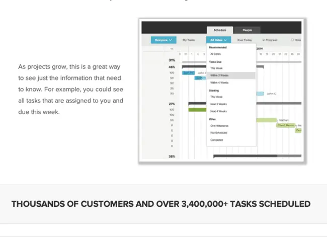
How effective would it be if they claimed to have “millions of tasks planned?” The number makes a big difference.
Customers want specific information about benefits that customers see and want specific examples of what they will experience.
Specificity is a powerful tool.
7) Ask readers to take action
The last killer technique of a conversion pro is the call-to-action.
If you don’t ask for conversions, you won’t get them. That’s why I suggest you start with the end goal in sight, and the whole point of your landing page is that conversion.
All your web copy should build to that conversion.
Do not be shy!
Likewise, writing CTA button text is just as important, if not more so, than the rest of the content on your page.
Remember how I said that CTA buttons are one of the ones that people actually read? It is important.
Simple wording changes can result in huge conversion increases, as in this example:

The next step should always be clear. This strategy varies depending on what your desired conversion is.
If it’s form submissions, make that form an irresistible eye candy. If they are downloads, create a button that begs to be clicked.
Have a flawless design. Information architecture comes into play here, because it’s important for a landing page to have a clean, crisp design that leaves all questions answered without inspiring new ones.
Navigation should be clear and simple, all required information should be provided and nothing should come between the visitor and the conversion (i.e. no popups!).
If at all possible, visitors should be able to convert in one click. Let every extra click hit your conscience until you find the opportunity to solve it.
Provide a clear call to action. This can be in the header as well as the button text (example: “send” versus “download your free marketing guide”). There should be no doubt about the next steps needed – tell your visitors exactly what you want them to do in big, bold text.
Make sure the visitor gets exactly what he or she is going to get (your free marketing guide).
And what exactly will happen when he takes the action (download).
Only ask for the information you need.
The more fields your visitors ask to fill in on your form, the less likely you are that they will take up your offer.
Sometimes just an email address is enough.
Optionally, you can supplement this with a first name to be able to compose a personal message.
The more you ask, the more people drop out, especially if it’s clear to the customer that your information request has nothing to do with what they’re about to receive.
Why am I being asked for my date of birth for an eBook?
In light of the GDPR, it is even more important to handle this carefully and only ask for what you actually need.
Plus, taking on the offer is the most important thing on the landing page with as little friction as possible (form fields).
You can always request more info on the thank you page once the CTA has been completed.
While most users don’t mind providing their name and email address, asking for info like phone numbers and date of birth can drastically reduce your conversion rate.
8) A/B test your landing page
A good conversion text writer doesn’t just write, you also have to test. How else do you know what kind of lyrics your audience appreciates better?
How else do you get better at it?
There are all kinds of A/B tests (we’ve reviewed the best tools to use here) you can do on a landing page:
Pictures
placement
flow
layout
However, usually the biggest benefits are changing the texts. To achieve higher conversion rates, you should test your content along with the other elements of your landing pages.
Don’t expect a doubling of your conversion with your first test. You will succeed by testing each variation carefully, methodically and deliberately.
Here are some things you can test:
Variations in the head
Subheadline Variations
CTA text
Lists of benefits
Also test small things. A single word change in the headline can have a huge impact on your conversion rates.
You don’t know unless you test it.
Overall, improving conversion rates starts with the great content. A lot depends on the words you type with your keyboard.
Fortunately, it is not an insurmountable task. Anyone can learn how to do it. With the right copywriting techniques firmly in place, you can achieve higher conversion rates.
Some additional information about setting up good landing pages.
9) Provide a visually appealing page
A good page is visually appealing. In addition to being easy to scan, it is also important that the visual elements grab the attention.
The right landing page contains relevant, quality images.
Bright, eye-catching graphics generally make for a more attractive page and a better user experience.
Visual cues
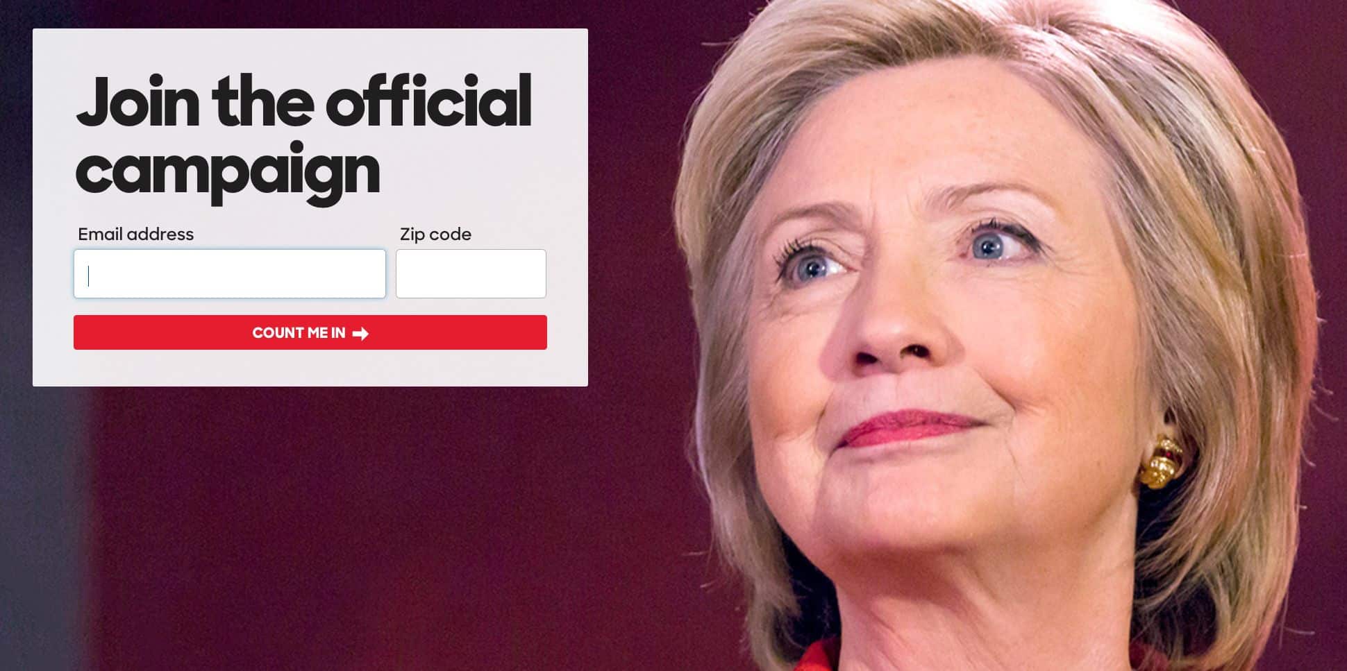
Consider adding visual cues to let the visitor know what to do next.
You can follow the obvious method using arrows, but you can also try something more subtle, such as focusing attention on an element using visual cues in your images:
(image: instapage.com)
Beautiful design
Provide a stylish, calm and beautiful design. Looks may not be everything, but it does count in landing page design.
The truth is. that appearance changes perception. Your landing page shouldn’t come across as grubby, but you can let it shine through whether you’re offering a high-end product or service or a budget version.
However, a very stylish and high-end site is not always the best route.
A super high-end site for a budget product that competes on price can also deter customers into thinking it is too expensive.
The appearance must match the offer.
Good use of colors
Use color to your advantage. Any Design student can explain the power of color in influencing human perception.
Picasso didn’t go through a blue phase because he was such a lucky guy.
Interior design books will often suggest different colors for different rooms and moods:
red for a dining room creates a dynamic conversation
yellow for a cheerful, relaxed kitchen.
This same color theory should be implemented in the design of your site.
Many marketers claim that certain button colors, such as green or red, increase landing page conversions, but ultimately you want to focus on the contrast of the button color versus the background color.
Test different colors, placements and sizes to see what works!
Beautiful design on any device
An effective landing page is also mobile-friendly. If you have a site that looks great on mobile, you can double your conversions.
Especially when you also advertise your landing page offer on social media. Most people via social will end up on your site via their mobile.
Don’t forget your thank you page design
Follow up with a thank you page. The thank you page is a great way to:
direct visitors to other related material on your website that they may be interested in.
Ask for extra information about them
See if they want to share your offer with others
Showing this added information on the first landing page would be distracting and result in visitors being less likely to convert.
However, now that you’ve closed the deal, the thank you page is the perfect place to suggest related products, guides, and information that your audience may find useful, or links to other areas of your site, such as your company blog.
Good design is also fast
The best landing pages are fast as Ferraris.
Speed is essential as load times have a huge effect on bounce rate.
Reduce load times by making your images no bigger than they need to be, using caching tools, and using a fast web host (some are a lot faster than others).
We’ve devoted an entire post to on-page optimization for niche sites
Also implement analytics in your design
Make sure conversion tracking is turned on. We always talk a lot about the importance of measuring conversions and it’s one of the best practices we recommend when creating landing pages.
Make sure you’re set up to keep track of how your pages are performing. Otherwise you spend money in the dark.
Before building a landing page
Before you create your landing page, ask yourself:
- What is the goal? In an ideal world, what would visitors do when reaching your landing page? Would they buy anything? To fill out a form? Sign up for a newsletter?
- Who am I competing with? Who am I competing with, how do they succeed and how can I copy their success?
- Who is my audience? And what are their expectations, dreams and ambitions? As silly as that may sound, it’s true to a degree – the better you understand your audience, the more responsive you can be to their wants and needs. Unless you know who your ideal customers are, it will be very difficult to write a persuasive text in the voice of the customer.
- How did they get to my landing page? Consider changing your post based on where your users come from. Another post may be appropriate for users who landed on your landing page from Google versus Twitter or Facebook. Companies with more landing pages (30+) generate 7x more leads than those with just a handful, so there’s no denying their value. Ideally, you’ll want a custom landing page for each ad group, but that’s a pretty tough operation, so start where you can.
Make sure your landing page matches the ad (if you have one)
The landing page must match the corresponding ad text.
Good landing pages use the same keywords from the PPC ad text.
The connection between what the visitor clicked on because he was interested and what he sees on the site must be clear.
This continuity assures visitors that they are getting what they clicked for.
Don’t send anyone to a camping tent and sleeping bag page with the more expensive camping tents at the top if your ad is about sleeping bags.
And don’t send them to a generic page or your homepage and let them search for what they were looking for.
Limit the options to leave the page
Do all roads lead to Rome? Great landing pages take into account all the paths entering and leaving their page.
It is important that you limit the starting points (in this case hyperlinks) that leave your page.
The goal is to direct visitors to a desired path, and if links act as a departure point from the funnel, they should be used sparingly.
Make it easy to convert. The goal is for visitors to convert as easily as possible, with as few distances as possible and as few obstacles as possible between points A and B.
For example, remove the normal menu on the landing page so that the focus remains on the call to action.
Conclusion
Well, it ended up being quite a post. Hope you were able to read it all the way through!
But if you only scanned quickly, that’s fine too :)
If you were able to take a few things out of it to make your landing pages even better then I’m glad I was able to help you.
Joost Nusselder is The Content Decoder, a content marketer, dad and loves trying out new tools en tactics. He's been working on a portfolio of niche sites since 2010. Now since 2016 he creates in-depth blog articles together with his team to help loyal readers earn from their own succesful sites.
